Care Cards
Week 3: 24-30 July
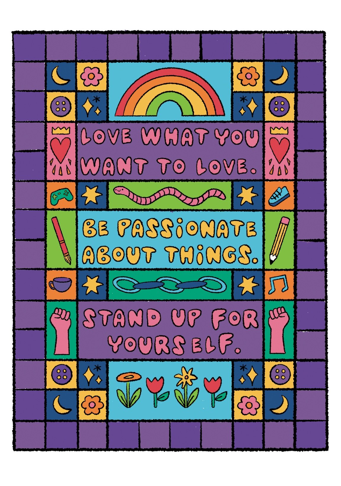
With my fonts created, I was able to move on to finalising the front and back designs of the care cards. Last semester I created a back design that I still like, but two of the three front designs, I am no longer happy with. Last semester’s designs are below.
The designs on the right (above) are the backs and just require custom font, formatting, and vectorisation. The designs to the left (above) are the card fronts which I intended to have a double usage as a small print, but I have since decided I only like the design at the top. While I like the concept of the other two, I did rush to complete them and I think their colours are also too similar and I want them to have their own personalities.
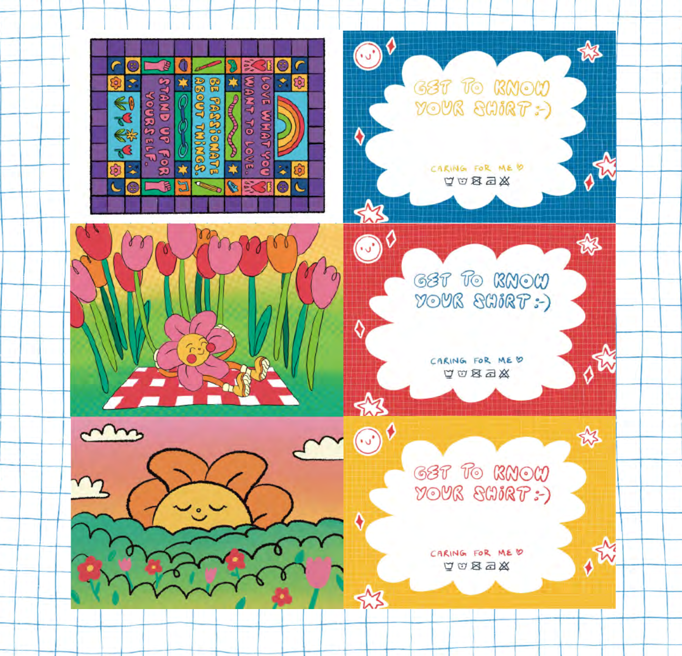
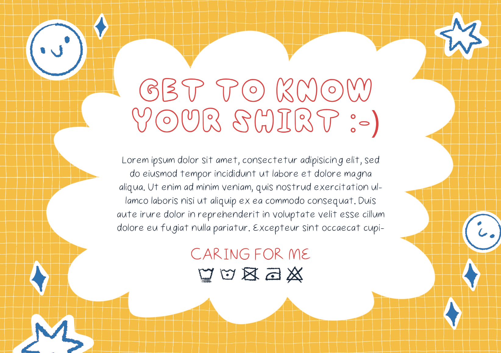
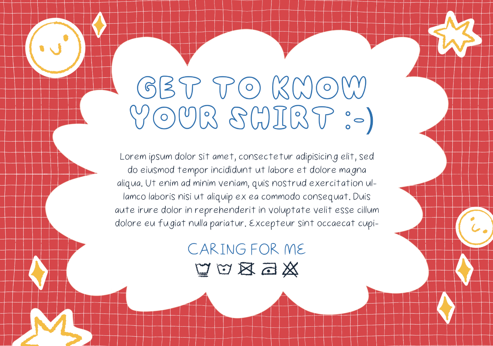
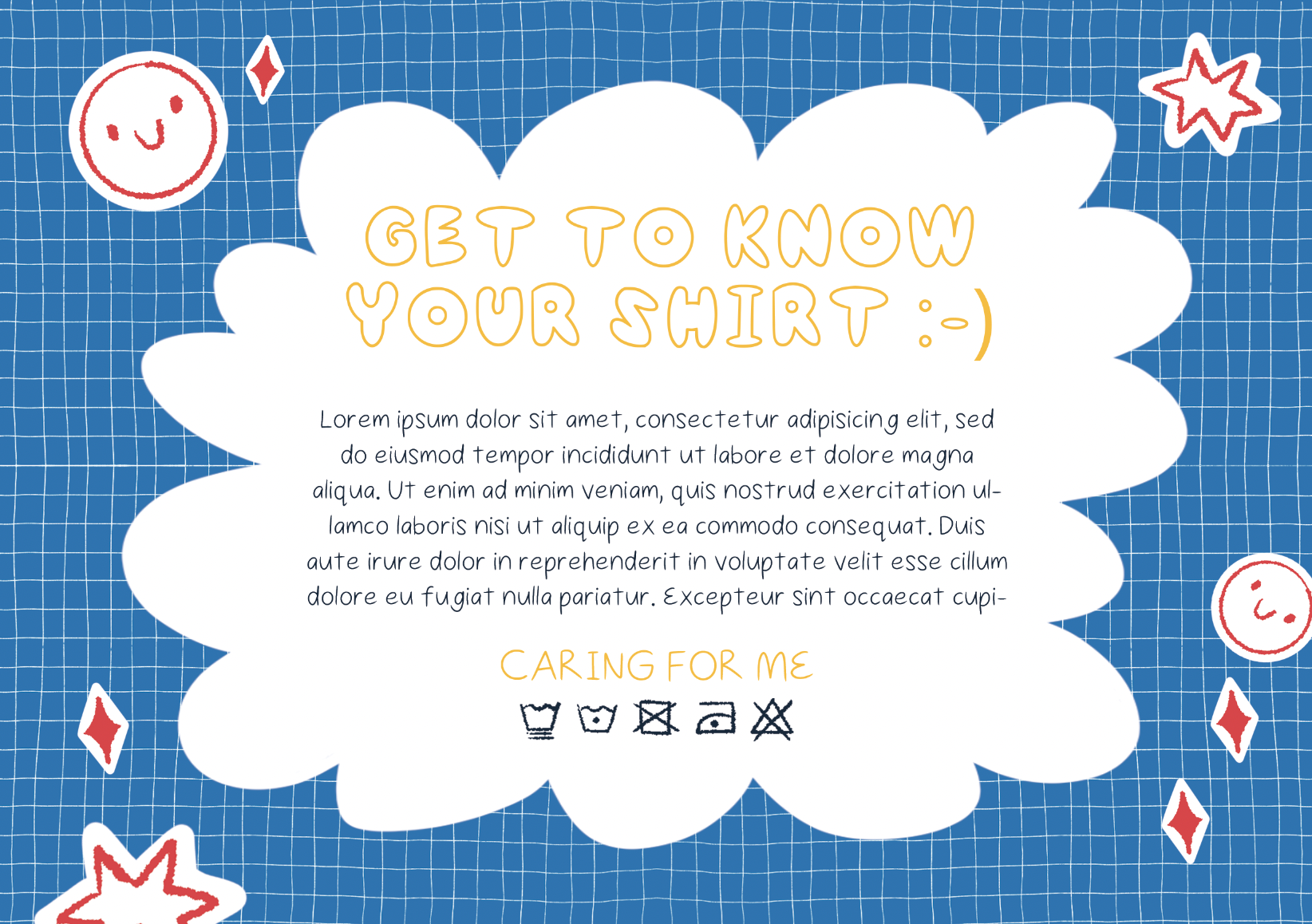
Below are the final care card backs. I added the font and changed the colours of the stickers on the outside. The only thing I have left to do is remove the placeholder text with my own and create appropriate care symbols for the shirts (which I will know once I complete the shirts themselves).
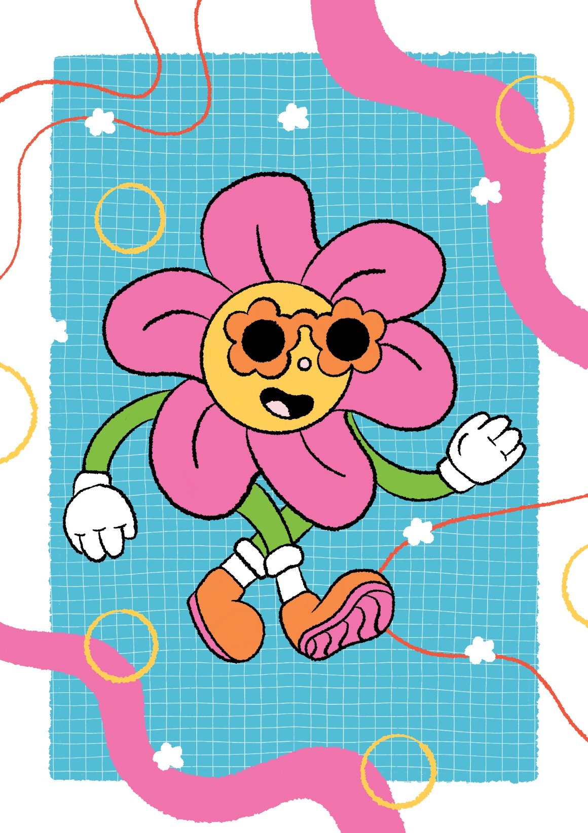
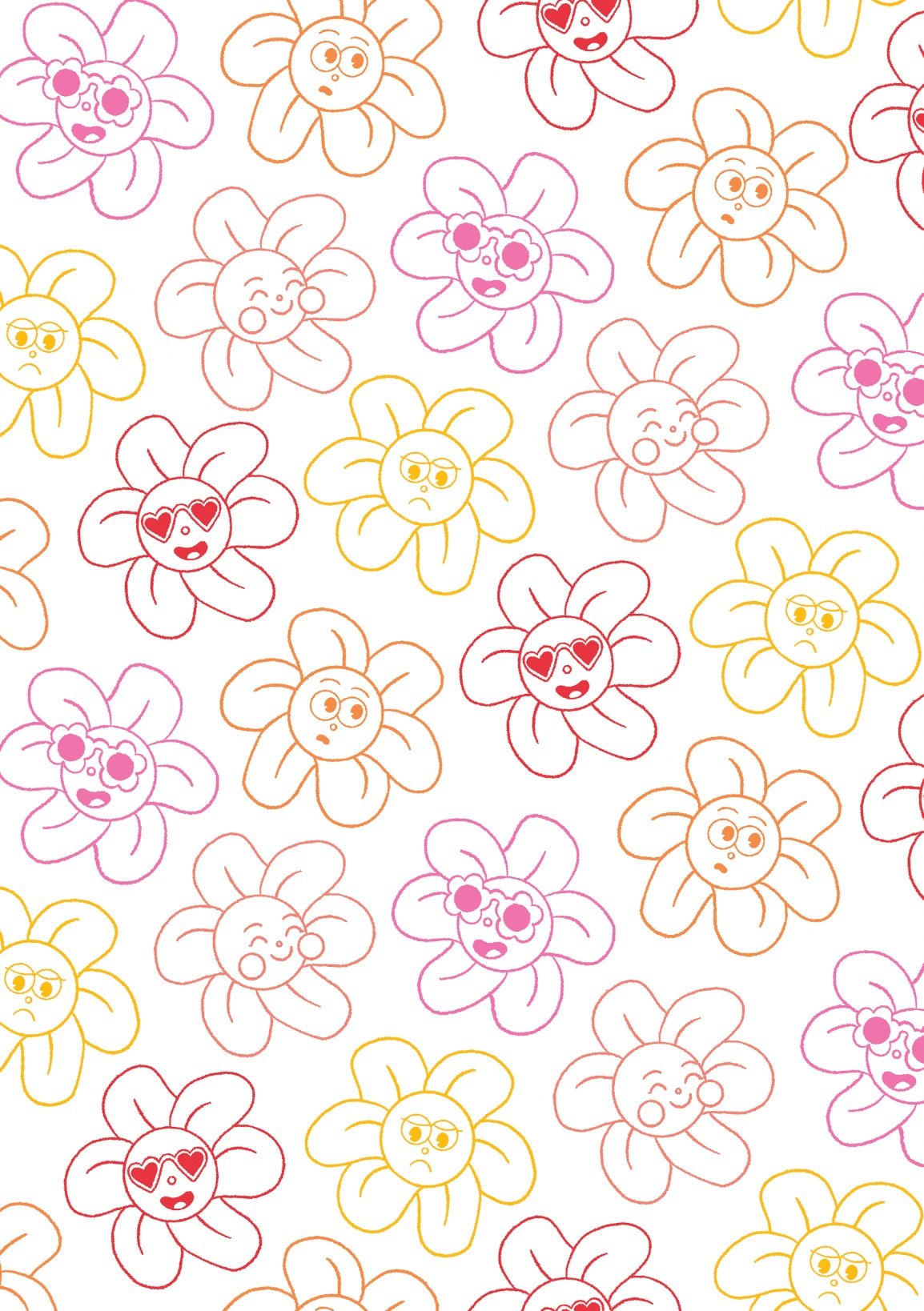
From here I worked on the front designs. I felt as though last semester I was avoiding drawing anything new and simply copied and pasted from my t-shirt designs but I wanted to put more effort in this time. As mentioned, the first design I kept, the second I featured a single flower with an 80s-like pattern featuring the colours from the other card front to create consistency there. Then the third one I decided to create a pattern by creating different expressions for the flowers. Up until this point I’ve really only showcased two faces so I wanted to dive deeper into the personalities of the flowers themsevles.