

A Lesson in Typography
Week 2: 17-23 July
After creating my to-do list week and organising what’s left to do on my project, I feel less stressed and feel like I have more clarity around my project. This week I began by creating my own font.
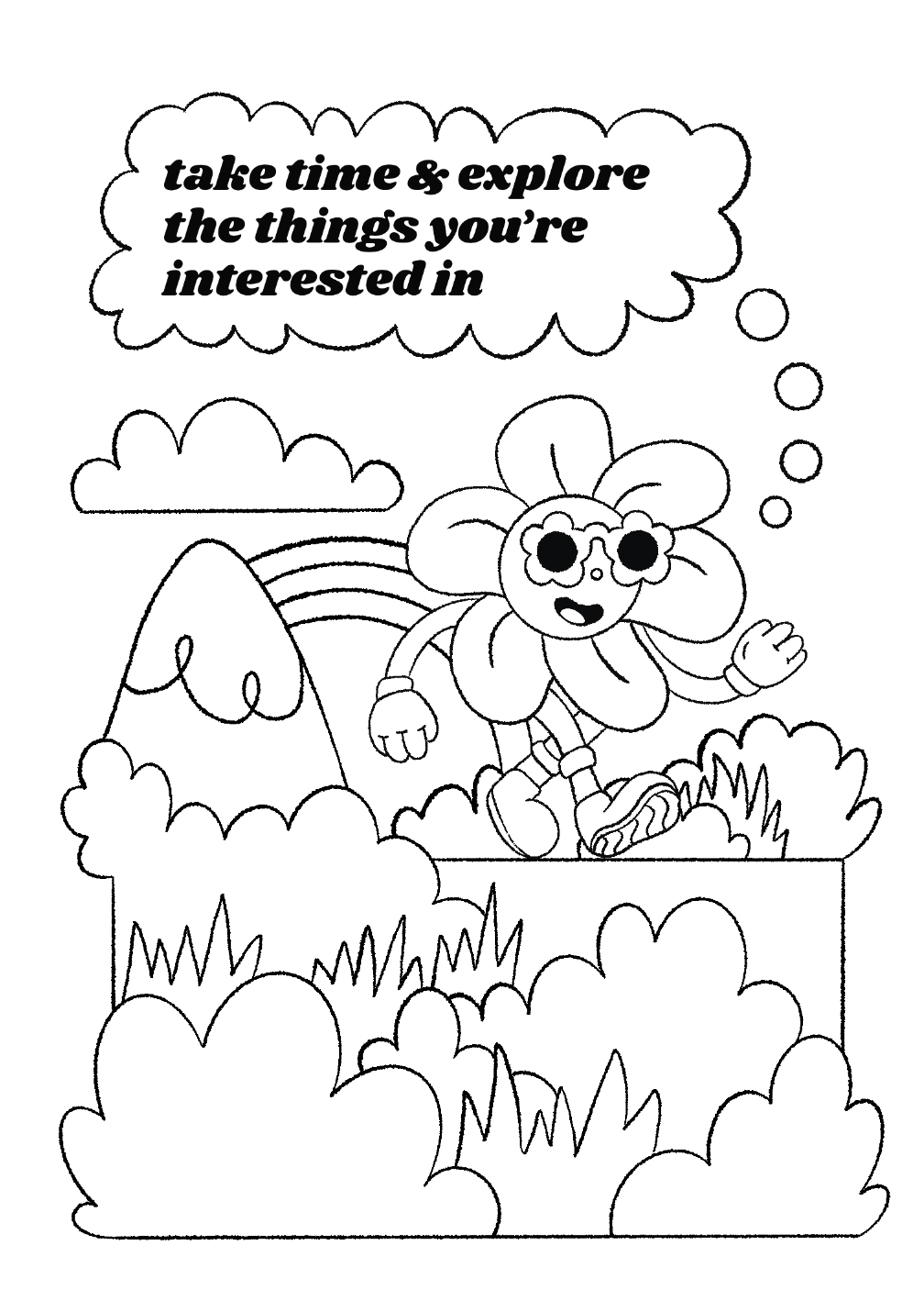
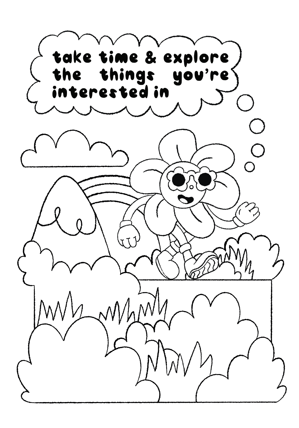
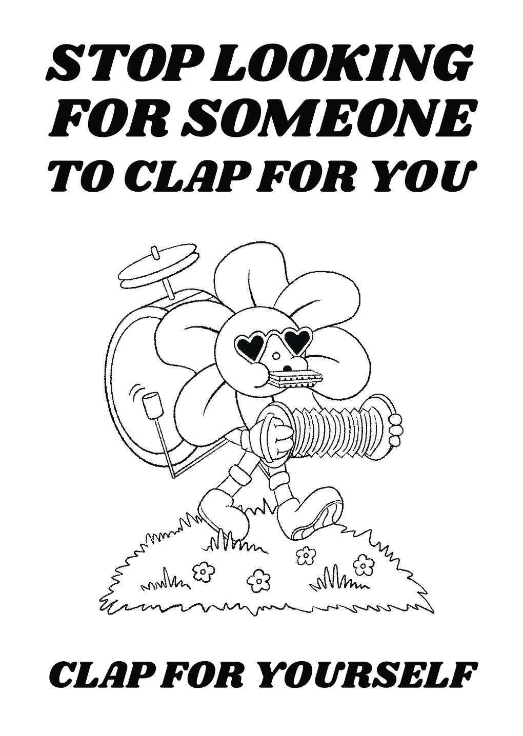
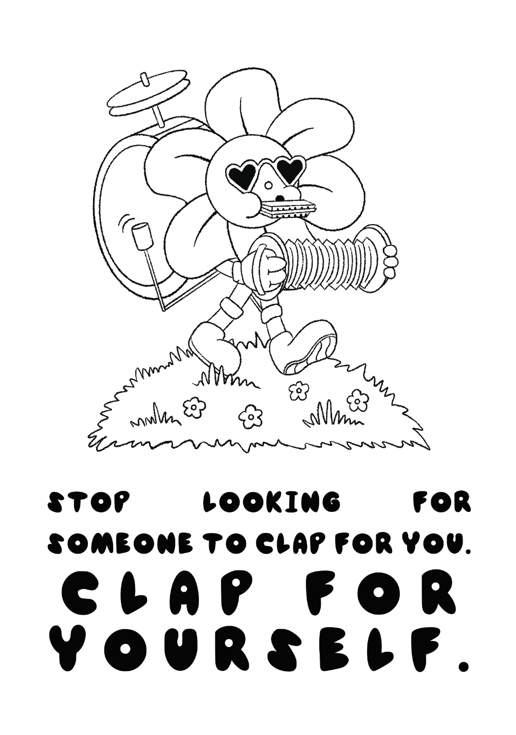
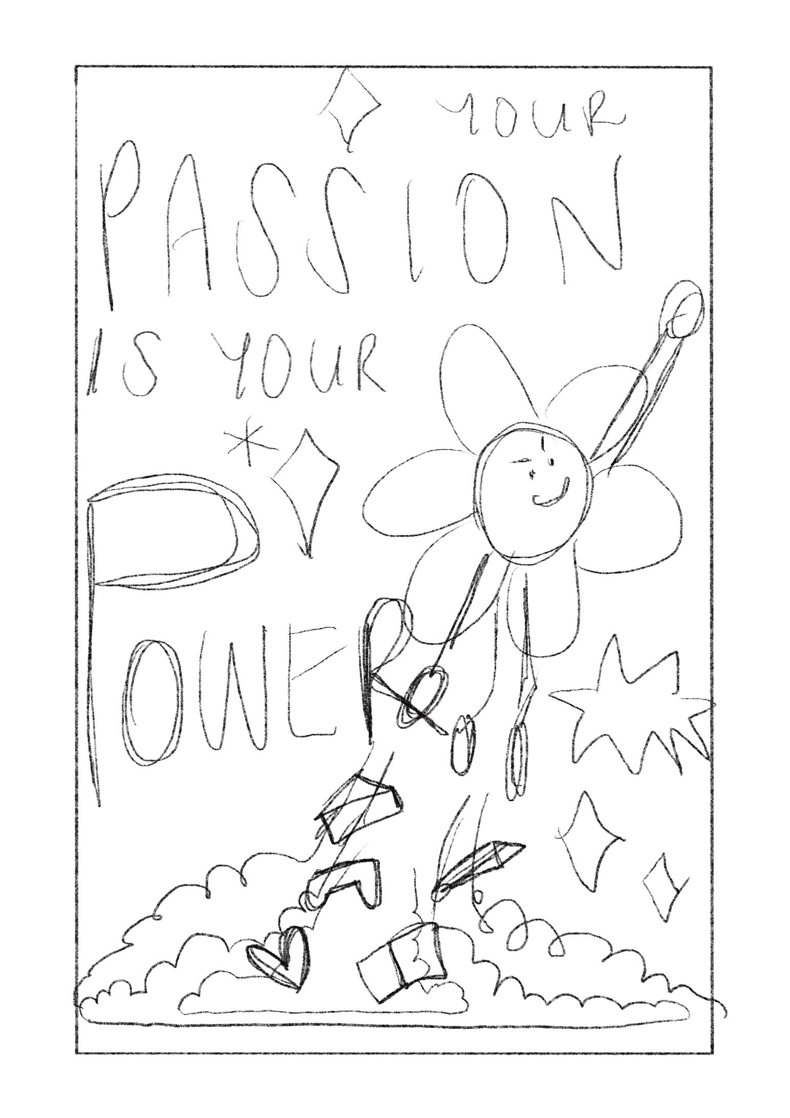
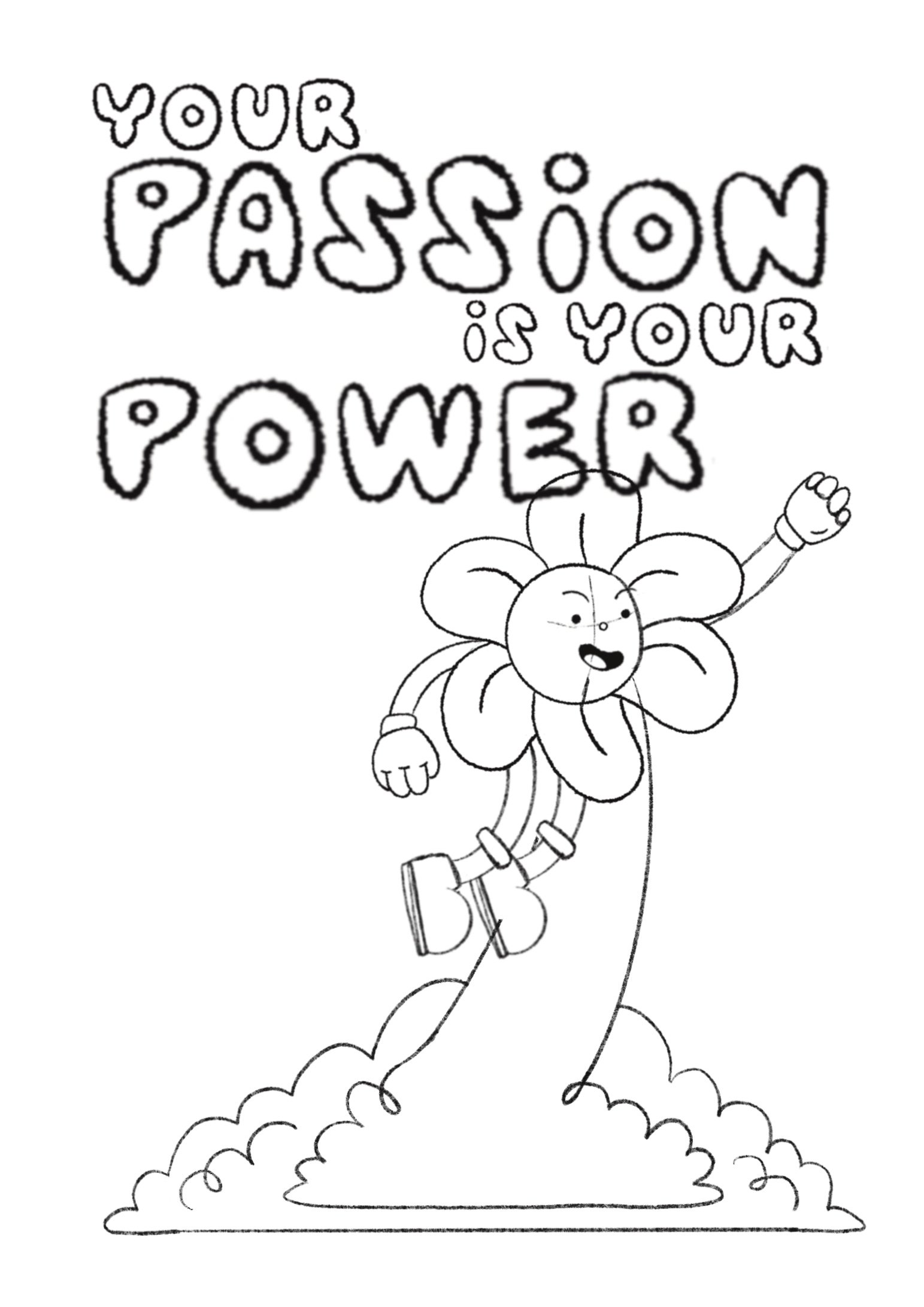
Creating my own font is something I’ve been wanting to experiment with for quite some time, but it’s just another design project that I’ve never gotten around to. In terms of font style, for a year or so now I have been free-handing my ‘header font’ in this bubble-like font but it’s quite difficult to maintain consistency when using a lot of it, so I knew I wanted to start there. Below are some previous examples of this font in action:

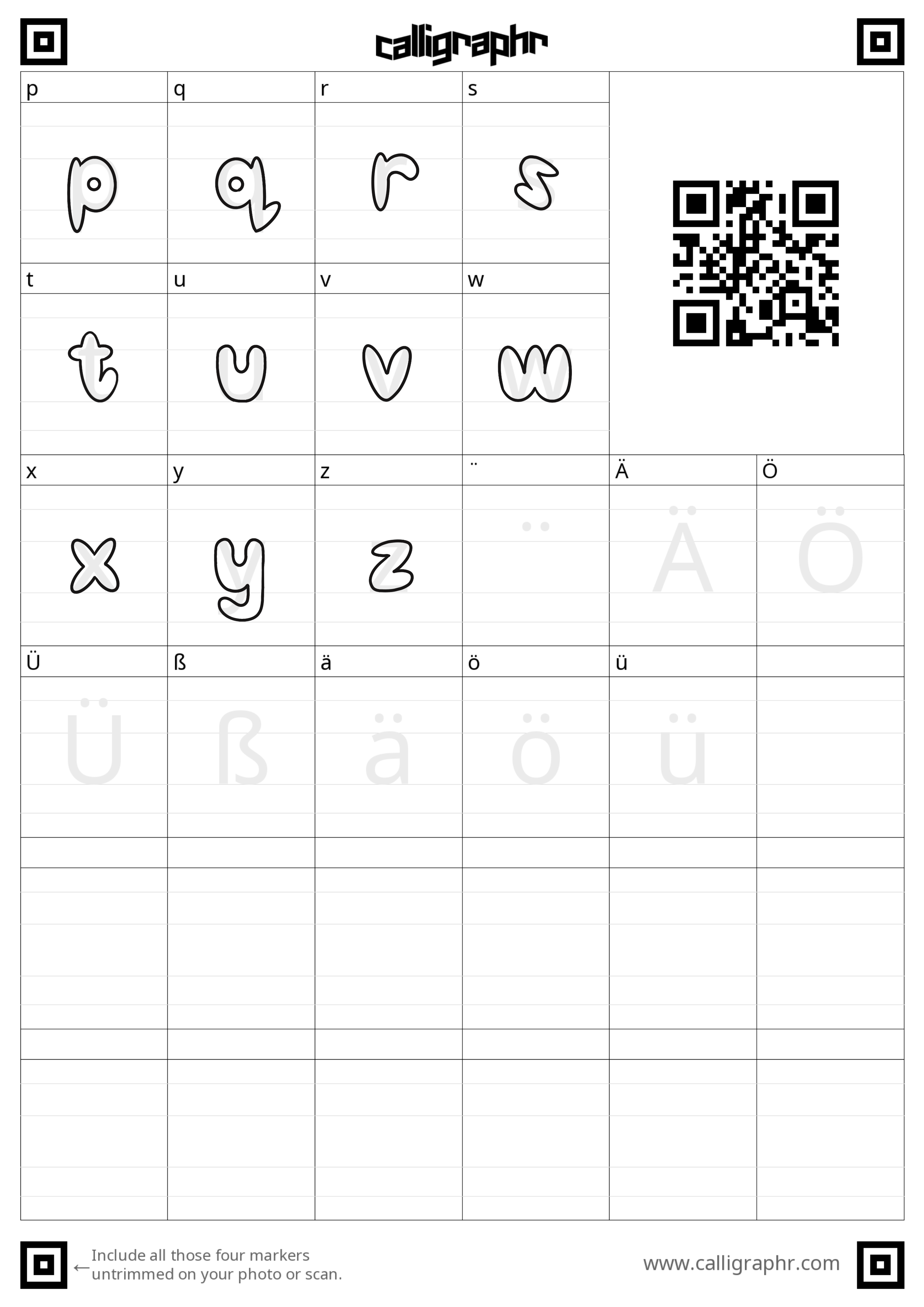
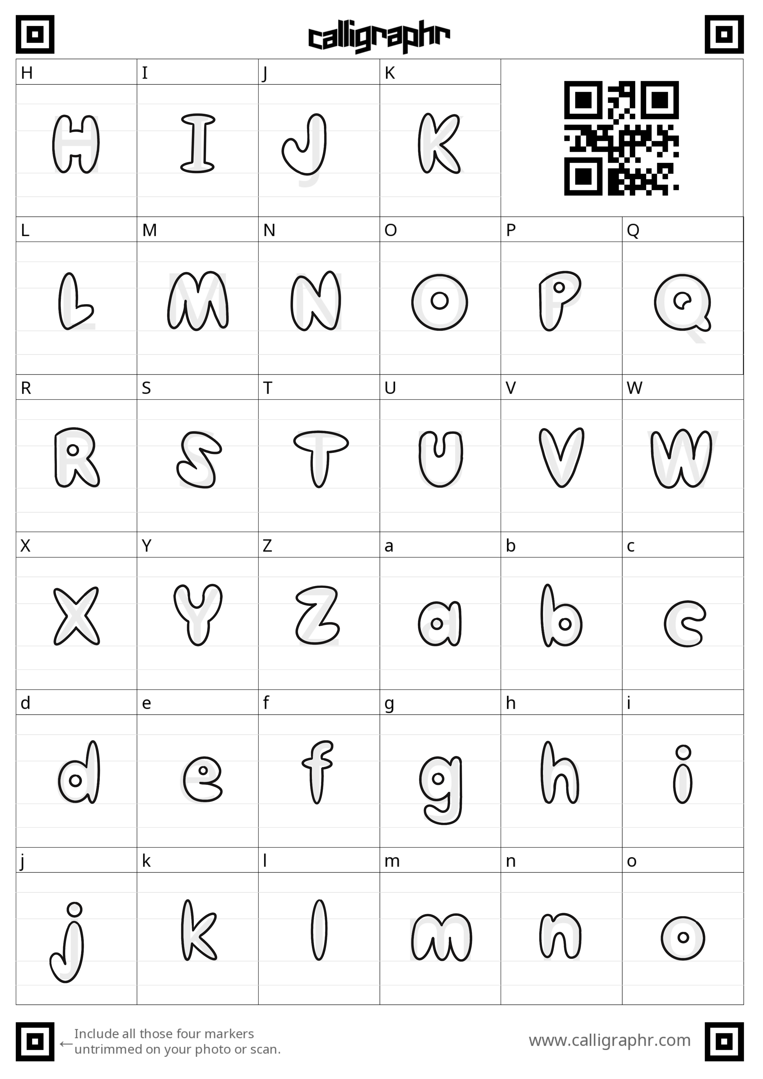
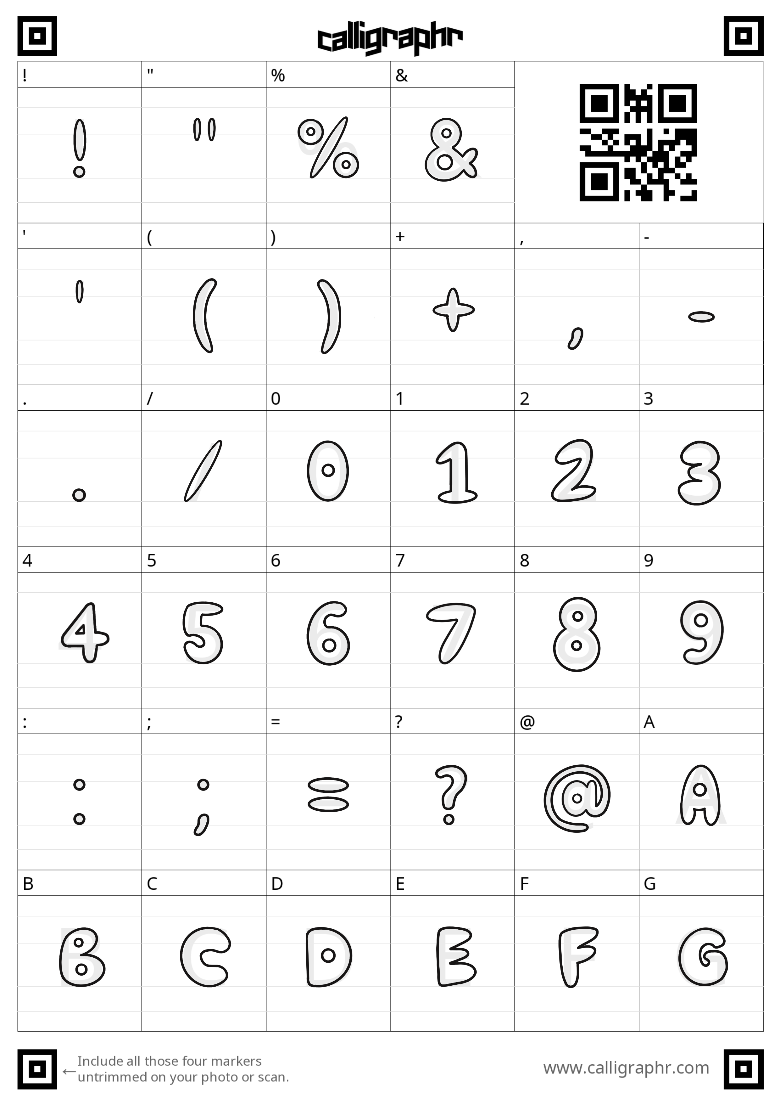
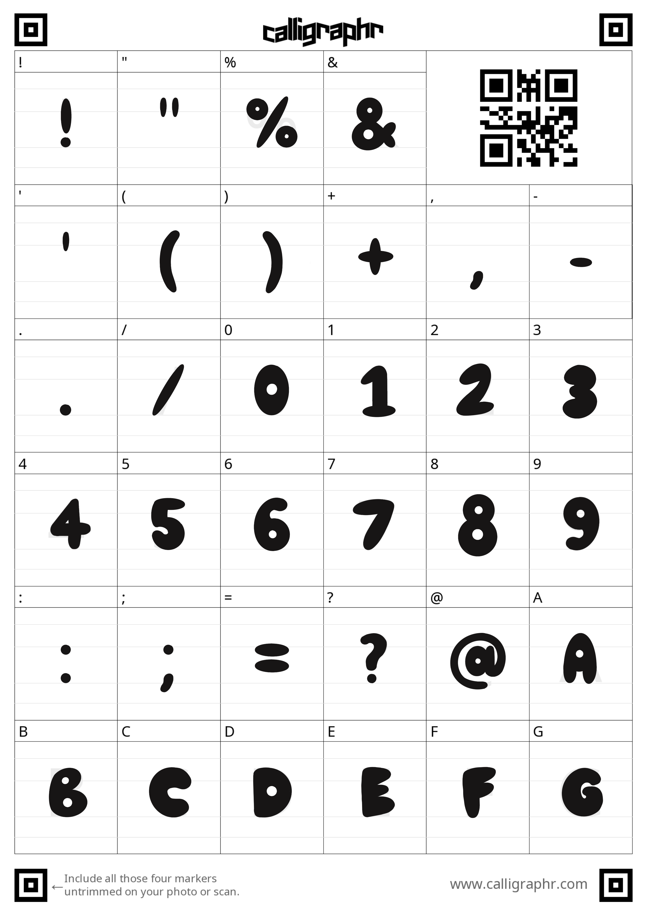
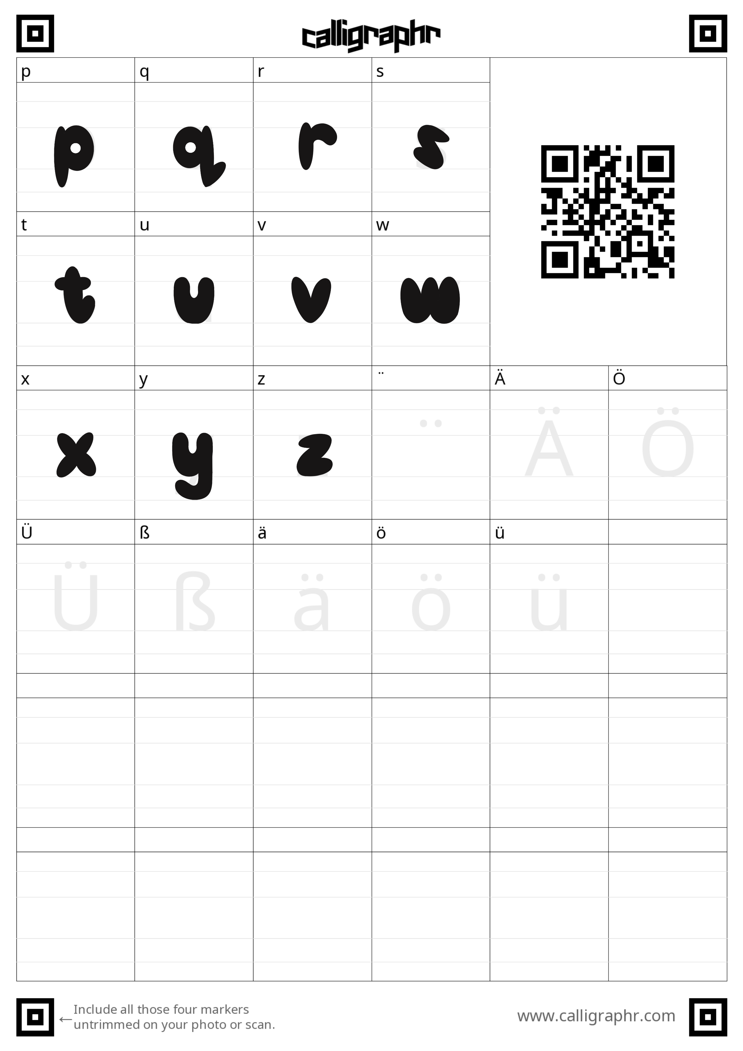
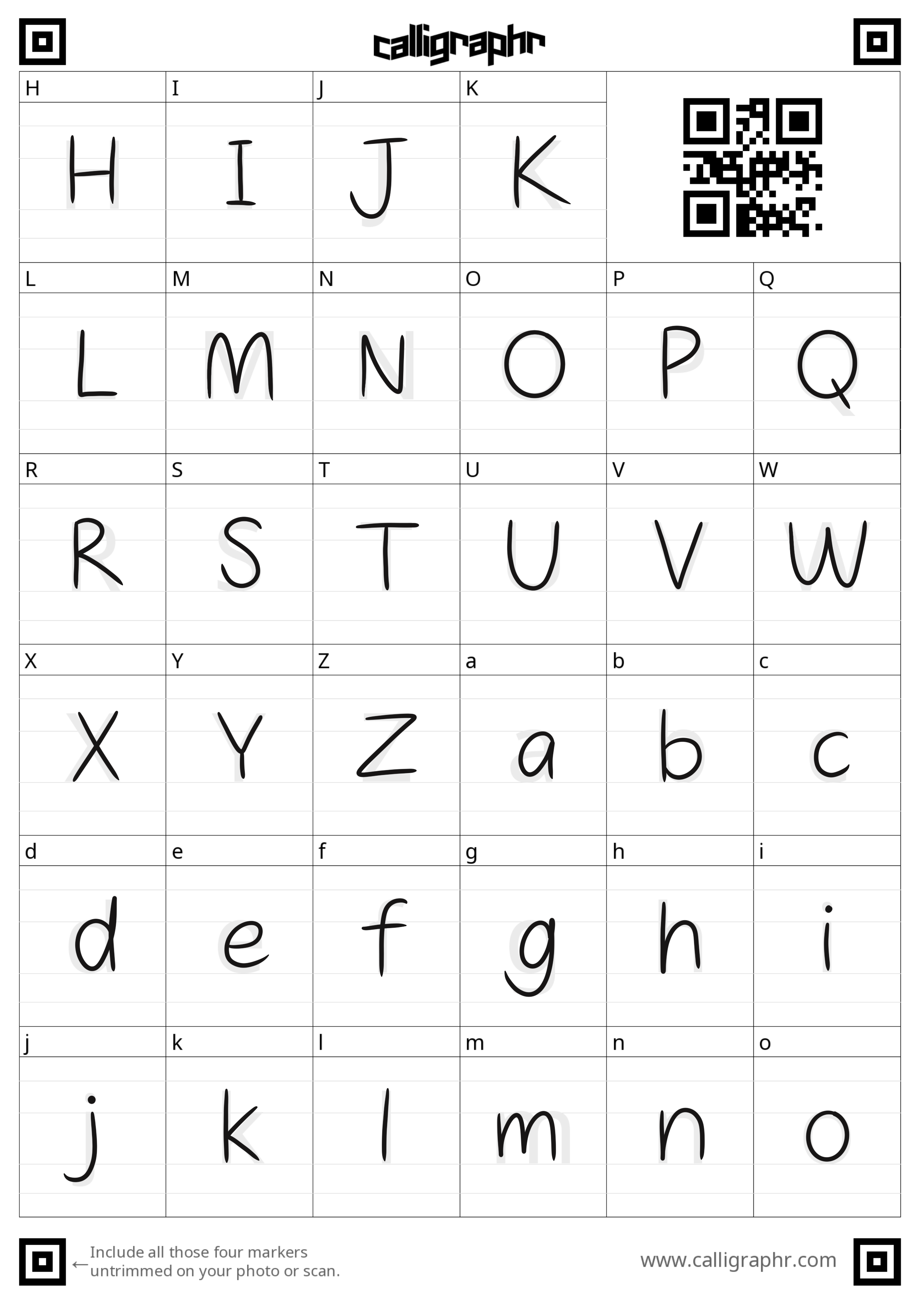
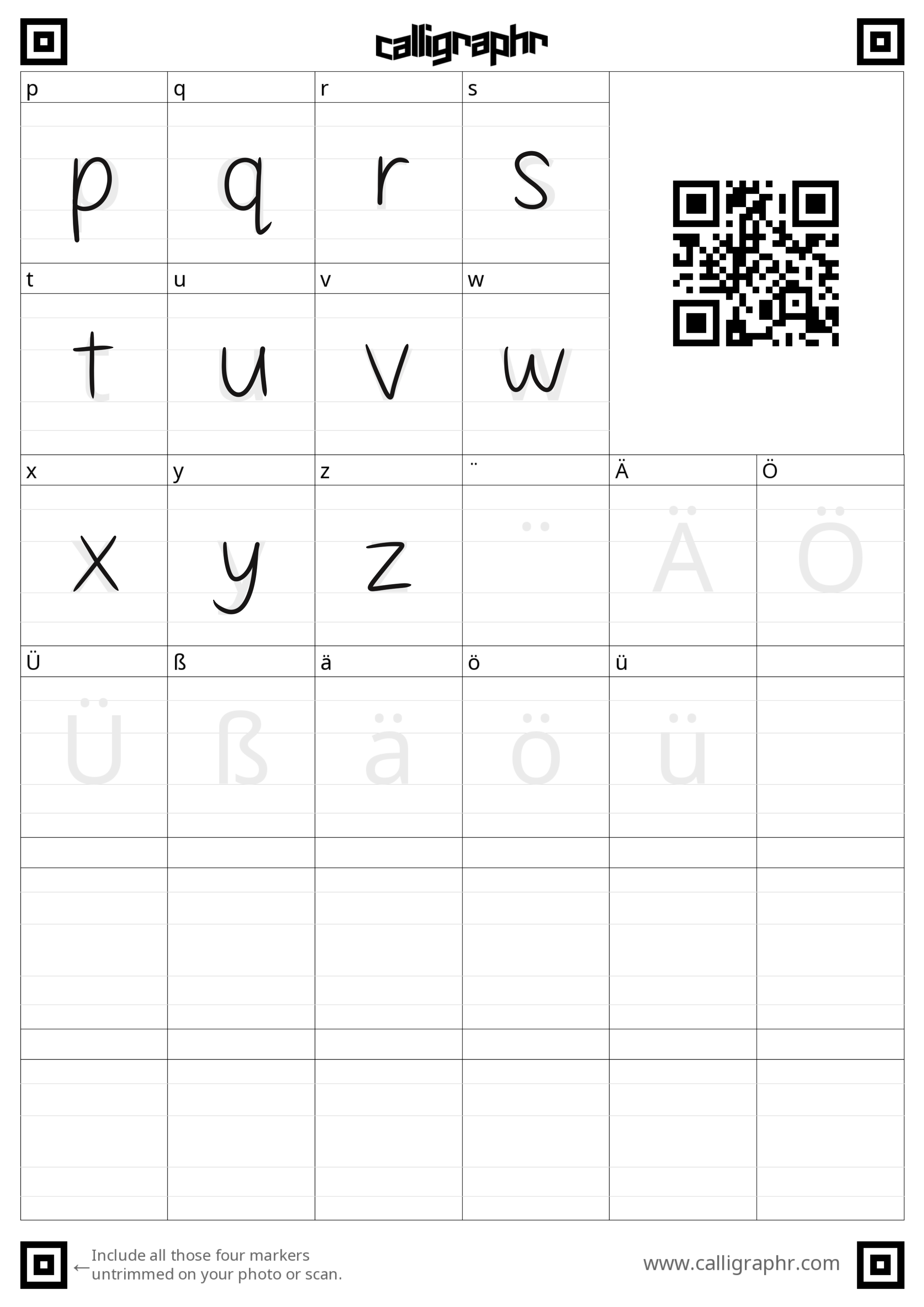
From here I went to YouTube to figure out the easiest method to create my font. I watched several videos before I came across designer and illustrator, Katnipp, who utilised Calligraphr to easily create several fonts. The site gives you downloadable/printable sheets to trace your letters, numbers, and symbols onto, where you then upload the file for Calligraph to create a zip file of your font.
I created three styles; the bubble font in an outline version and a solid version and then just my handwriting. Below are the sheets I imported into Procreate to draw my own design:
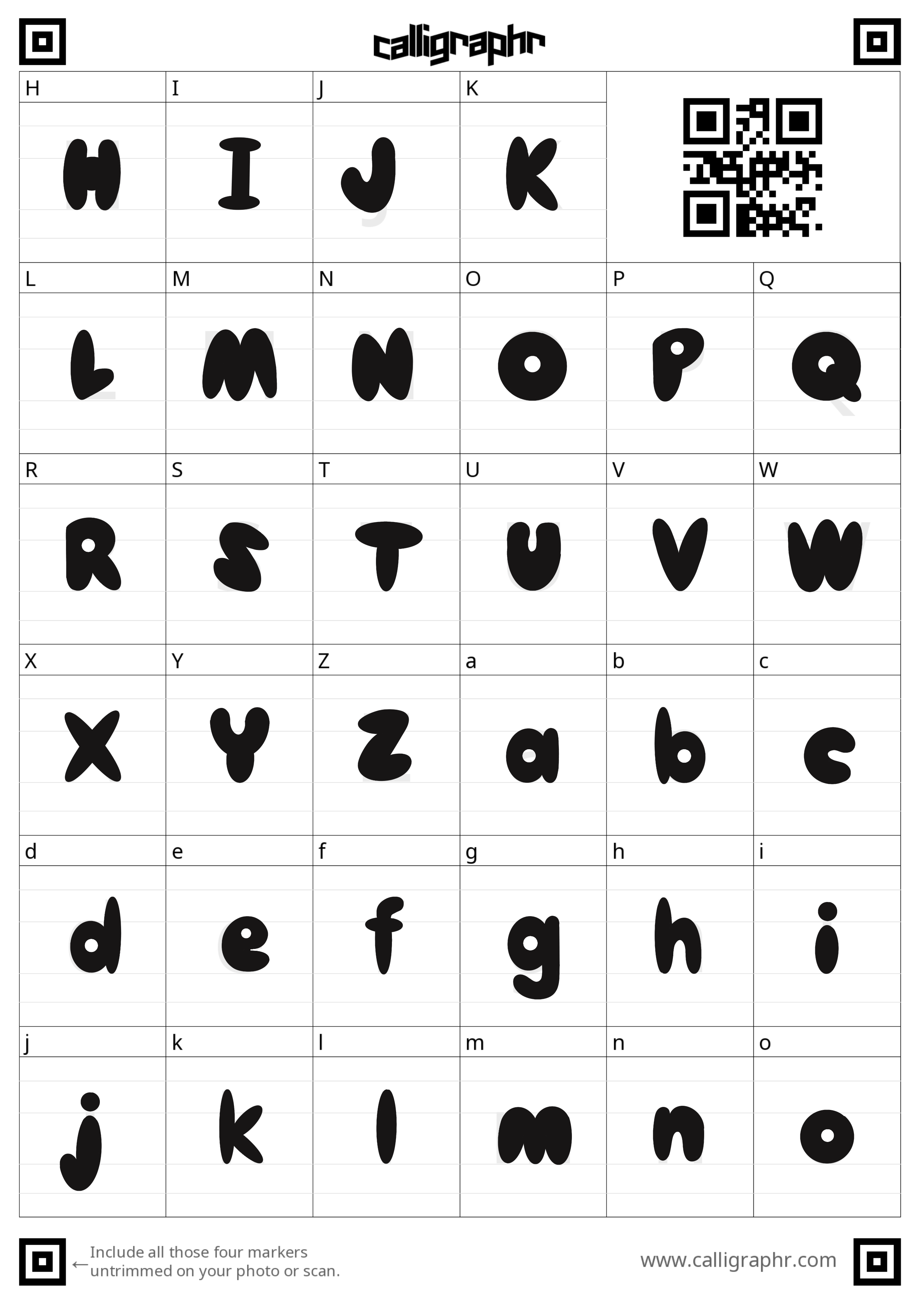

This process didn’t take very long and the importing process was extremely simple so I would definitely use Calligraphr again. Below are the final fonts typed out in their entirety and then placed onto my existing designs.

Upon making the fonts and adding them to existing designs, I made the decision to cut two of the original five designs. I did this for several reasons:
I didn’t feel the designs worked as t-shirts/wearable designs - they would be better as a print
I didn’t think I was going to have the time to create AR illustrations for all five so by cutting down to three, I will be able to spend more time creating three great-quality animations, rather than five moderate ones
The final design was giving me grief. I tried for several days to re-arrange the composition and get it right before I decided that the message reflected in the design would probably work better as a print also
With my font sorted and my decision made to create only three designs, I will now focus on finalising the packaging materials next week.