

SCREENPRINTING


I received my screens back on Wednesday this week and then on Thursday night I began anf finished the screen printing process. Before I used any of the screens on the actual shirts, I tested them out on paper to see how much paint and pressure I needed to apply and to make sure any open spots on the screen were covered. I found straight away that the white ink was a vastly different consistency to the coloured inks (even though they’re all the same brand), so I was worried as to how that was going to react on shirts.

I decided start with printing all the back designs first, using the white ink. In hindsight, both of these decisions weren’t a great idea because the white ink wasn’t very forgiving to me learning the best practice for screening and I would have rather the front design be a little off over the back design, however I persisted.
Below are some example of what happened with the white ink. It got quite thick in parts (especially the text) and so it smudged, but then because I could see that happening under the screen I was reluctant to add more paint and so other parts didn’t print as opaque as I would have liked. In comparison the red and blue ink are crisp and clear and I’m really happy with those.


Overall, I think this process went fairly well. I think I will do some minor touch-ups on some missing lines or lighter parts of the shirt but overall, I’m happy. I do think that if I had more time I would have done a couple more tests and perhaps some more tests on other material to get the pressure and paint amounts just right.
The final step to this process was testing the AR component with the shirts. As mentioned in my earlier posts, I had tested it on a flat image of my design as well as on the initial shirt I digitally printed but this was the final step in ensuring the AR would work.
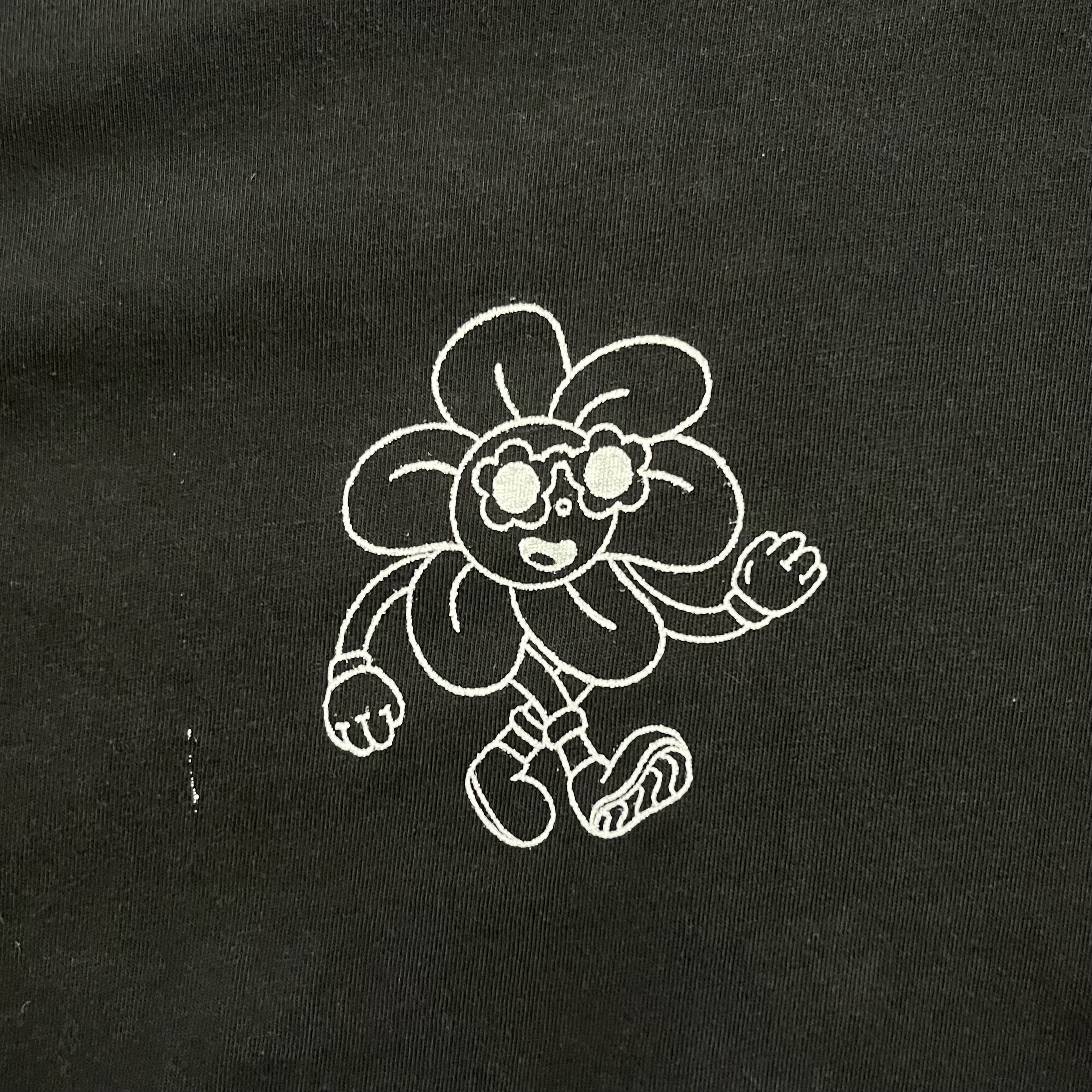
Again, like I mentioned in my earlier posts, it didn’t matter what colour the outline of the design was, it still worked, however I didn’t think to test the background colour. When doing my tests, the two white shirts worked great (below) but the white design on the black shirt couldn’t even be picked up.

I’m really happy I committed to the AR component of the shirts but I do wish I’d thought about it some more. I’m happy with the coloured designs and in the future I would like to experiment with animation. I’m just disappointed I didn’t think to trial the design on a dark background, knowing full well I was going to be used white ink on some of the designs of my shirts. I think too, if I were able to screen print the shirts earlier, I would have had more time to play with the AR process because ideally that it a step I would have taken last.